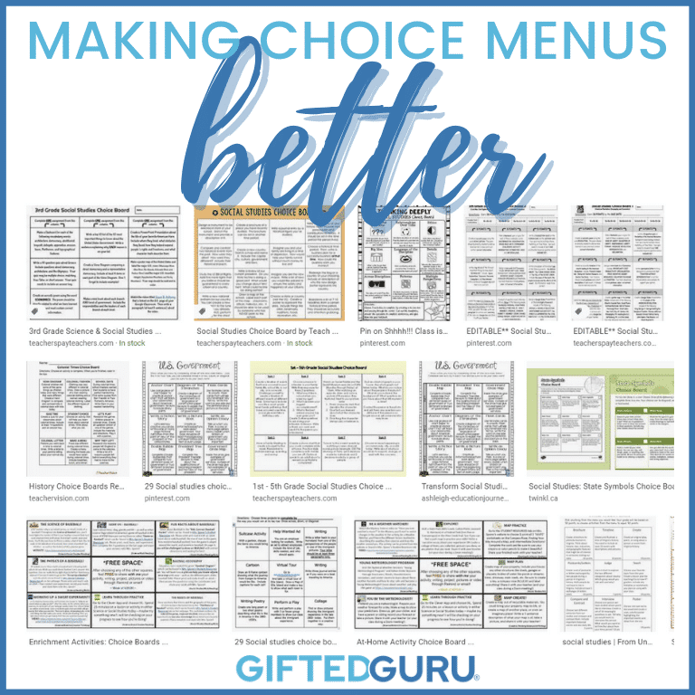
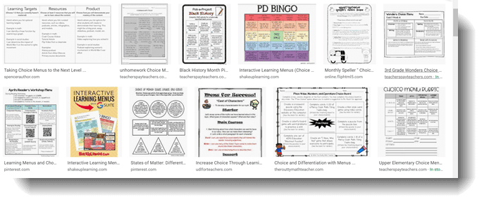
Choice menus (sometimes called Extension Menus or Choice Boards or fifty other titles) are a foundational technique for many teachers. Typically, they’re a grid somewhat like a tic-tac-toe board that has different options students can choose from to complete some task or project. Just do a quick search and you’ll see thousands of them.
I’ve taught teachers how to use them for years, and when my colleage Ian Byrd wrote about why he’s totally over them, I realized I’d been leading teachers astray.
Now, I don’t agree with Ian’s conclusion (essentially that we should ditch them), but I do think we need to be better at creating them. To do that, we need to understand their true purpose and not fool ourselves into confusing quantity with quality.
If You’re Doing This, You’re Doing Menus All Wrong
Let’s look at a few examples of Menus Gone Wrong so you can see what Ian’s talking about.
Menu Gone Wrong #1
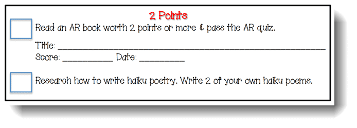
Look at the two choices in this section of a menu:
You already know how I feel about Accelerated Reader, so I’m not going to give a lecture on how much I hate it. For our purposes here, that’s not the point.
The point here is the total disparity in the quality of the thinking required for these tasks.
Read a book and take a low-level quiz on it or research a topic and create a product based on that research. These tasks are connected how, exactly?
It’s like saying, “Either take your car to the car wash or develop a new chemical formula for a superior cash washing soap.” They’re just not on the same playing field.
First, let’s be honest: most of our students can pass the AR quizzes without even reading the books. So there’s that.
Secondly, there is no way that a knowledge/comprehension task is the pedagogical equivalent of a research/create task.
It definitely offers the option for high ability learners to avoid a mind-numbing AR test, but just because a student can do higher-level work doesn’t mean they’ll want to. Your high-ability learners could just as easily pick reading a Puppy Place book (those are 2 AR points) that’s four hundred points below their Lexile. And then where will you be? How is that really differentiation?
If Ian reads this, he’ll be (metaphorically) bashing his head into a wall. This is exactly the kind of nonsense we see in menus.
It looks good because there are options, but it’s not actually good.
Menu Gone Wrong #2
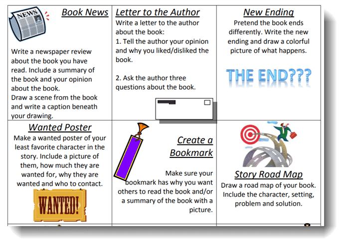
This is a book report menu. Students can choose any way to share their understanding of a book they read. There are really nine choices, but I’m just showing six because you’ll be able to see what I mean from them.
I was going to leave the horrible clipart out of the discussion, but I really can’t because it’s part of the problem. The teacher is taking up space with pictures that could have been used for better instructions. You can make stuff look good – I believe there’s real value in that – but not at the expense of pedagogy, and not for something ugly like this clipart.
1990s-era clipart aside, I have two real beefs with this menu.
First, it’s dying on the hill of “I must have nine choices to be a menu.” While you can only see six, you know what I’m saying. There’s no magic in the number nine. The teacher could have accomplished the same idea of student choice with fewer choices that were better aligned in thinking level.
Secondly, there is not separate rubric, so the only information the student has about the task is what’s in the little box. Look at the section called “Letter to the Author.” There is nothing about the quality of the work. A student could write, “Dear Ms. Patterson, I hated your book because it ended sad. Why did you write such a sad book? What is your middle name? Do you like ice cream? Sincerely, Sidney Student.”
This would fulfill the requirement as listed.
It would have been far better for this teacher to have fewer choices and have those choices more fleshed out to encourage quality thinking.
Menu Gone Wrong #3
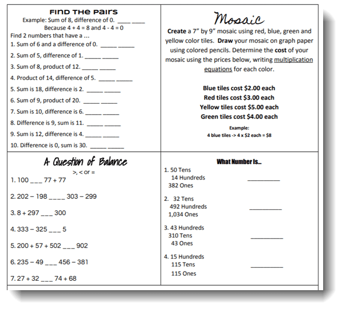
Let’s look at a math example. As you look at this, consider the different standards being covered here.
First, let me say that the options in the top of the menu are strong. I have no beef with that. The options on the bottom include concepts that must be mastered, no argument there. (This menu only had four options.)
Now that I’ve complimented it, I’m going to tell you what’s wrong with it.
The menu has four different tasks with four *very* different standards. I was going to go look up all of the standards, but I don’t think we need that. It’s easy to see that they’re so, so different. Place value and equivalency are not the same.
Why is this a problem? Why does it matter if the menu is a hodge-podge of standards?
Because it begs the question, what exactly are you trying to do here?
If you are doing this as a review, you’d need them to do all of it (unless you had some kind of pretest for the menu, which is not a bad idea at all).
This menu also suffers from a common issue: too little actual instruction. Look at the top left corner. Are you 100% confident you know what to write on the lines? Would your 4th-graders be?
The Mosaic activity and the “Find the Pairs” activities are both quality activities that deserve their own time. They don’t need to be lost in a sea of other choices. They are at different thinking levels. Just let your mind rest f or a moment on the “Find the Pairs” activity and then on “What Number Is…” It only takes a few seconds to feel the difference in neural pathway involvement between the two.
If students can actually choose these, you could easily end up with students choosing tasks that will not stretch them at all.
Menu Gone Wrong #4:
This one is the one that really got me. I realized I’d done so many almost exactly like this, and I was making some critical errors. Do you ever want to go back and apologize to former students? Yeah, that’s a thing.
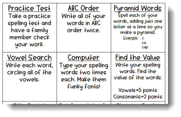
There are a number of things that are fine with this menu. Giving lots of choice for basic practice is a valid use of menus. Here’s what’s wrong:
- Having a pretest be a choice is a huge no-no. Everyone should pretest, and they’re work should be adjusted as a result of that pretest. Having students take a pretest and then practice all of the words the same no matter how they did is ridiculous and a waste of time (both yours and theirs).
- Typing words is not how the brain learns to spell, so that’s another waste of time. I love fonts, but having students put the words in a funky font is an egregious misuse of technology that defies all we know about the neuroscience of learning.
- Writing words in ABC order is trying to practice two skills simultaneously: alphabetizing and spelling. Kids who struggle to alphabetize will not gain the benefit they could have from another activity that didn’t require mastery of alphabetizing to accomplish. This is a perfect example of how students with any kind of learning difficulty or deficit get a double whammy.
So, I’ve shared some examples of what can go wrong. Let’s look at how to make it better.
Making Choice Menus Better in Five Steps
Choice menus are a useful tool in a teacher’s arsenal, but only if they’re done well. This is true of so, so many things! Here are five steps to making choice menus better.
1. Make the purpose of your menu clear.
Just having menus because you think you should is poor pedagogy. There is nothing inherently superior about letting kids choose their tasks. The tasks must be worthy of being chosen. I know this goes against the self-directed learning mantra being spouted everywhere right now, but I stand by it.
Choice alone is not adequate differentiation.
With menus, choice alone can never be the goal. It’s insufficient.
What is a worthy goal of a choice menu? Here are a few possibilities:
- I have students with disabilities and I want to include options for them without having them feel separate or excluded.
- The students are going to be presenting their work, and I want to offer a variety of presentation modalities to keep the interest of the students who will be seeing the presentations.
- I have several quality possibilities for demonstrating learning that I’ve used over the years, and I think students may have strong preferences for one over the other. I’m going to give them choice to decrease resistance to the assignment.
- The content is new to students, and they need different types of exposures to it.
- There are a number of steps in an activity, but they don’t need to be done in order. I want to maintain student interest to the greatest extent possible by allowing them to choose the order they do them OR I don’t want all of the students on the same step at the same time because it means they don’t all need help at the same time.
- I’ve pretested them, and I need different choices based on the results of the pretest.
- They’re at the point in the process of knowledge acquisition that they need lots of different kinds of practice, so I’m giving them lots of different kinds of practice opportunities.
This list is not exhaustive, but you get the idea: choice menus must be about more than just looking cute. There must be intention and deliberation behind them.
Teachers must be able to answer the question: In what way does this truly advance students’ thinking/learning/experience in a way that a single opportunity would not have?
2. Keep the thinking foremost in your mind.
Ian and I have a mantra: It’s not about what they’re doing; it’s about what they’re thinking. Too often, menus are all about doing. Are they making a brochure or a poster? Are they making a crossword or a wordsearch?
Here’s where Ian and I split: I would consider differentiation of product a type of differentiation. It’s just not enough by itself.
Consider the spelling word menu above. I’m pretty sure this teacher did what I used to do: just think of a bunch of different things kids could do with words, and then make those the choices.
What would be better is to truly consider what activities actually help kids learn to spell. Which words are kids most likely to misspell? How can the menu make it more likely that students will acquire the knowledge they need?
Here’s one idea: The research is clear that the practice of interleaving leads to better acquisition. Interleaving is when students can’t answer a group of consecutive problems with the same strategy. It’s research-speak for “mixing it up.”
To add that research-based strategy into my menu, I can make sure that the students have to select options that don’t allow for use of the same strategy over and over. I have to make sure the menu offers different types of thinking.
Here’s another idea: I want students to identify patterns in their misspellings. It makes no sense for students to practice spelling words in isolation if the issue is actually a particular type of phonetic pattern. To do this, I must use the pretest and have students do some self-reflection of the pretest. I need to look at it as well. I need to know if missed words are part of an ongoing issue with “th” words or words with a silent letter. You get the idea.
While I’ve used a spelling example, what I say about this applies to all. We need to be thinking about thinking before we think about doing.
3. Two is a choice.
Let’s abandon the idea that choice menus need to have nine choices. There are no choice menu police who are going to show up at your classroom and demand an explanation as to why you only offered two or three choices.
Additionally, as I mentioned before, I think choice is somewhat overrated. I don’t let eight-year-olds choose everything they eat, and the idea that students with no training or experience are superior at pedagogy to trained teachers is somewhat silly.
If we think that our students know better than we do about what they need to learn, we don’t know our students well enough. Enter more/better preassessment.
Giving a choice is great. Humans in general don’t like to feel trapped, so choice can allow students to feel more autonomy. That’s necessary for motivation. However, choice shouldn’t trump quality pedagogy.
If you have two great activities that go with the learning goal, give a menu of two. If you have three, then use those. And if you have one solid activity, then use that and don’t feel badly about it.
Only give the number of choices necessary to accomplish the goal, and only give the number of choices that you can offer while maintaining quality.
This will grow over time, so you may find that after a decade of teaching something, you have more activities than did. That’s fine, too.
4. Don’t skimp on the rubric.
If the menu choice offers more than just simplistic tasks (e.g., “Solve this problem and then create another similar problem that uses the same solving process.”), you need to have a rubric available.
In the book report menu above, you can see exactly what I mean.
It is unlikely that there will be enough space in a choice menu to give students the information they need to do a full and delicious job on it.
Solutions include making the choice menu digital with links to rubrics for each choice or having the rubrics available on paper somewhere else.
You don’t need to give every child a copy of every possible rubric. That’s overkill. Just make sure they exist and are available. Not that I don’t think my author letter was amazing…
5. Remember that it’s not enough by itself.
As I mentioned earlier, choice alone is not sufficient differentiation.
Differentiation must involve adjusting learning to students’ needs and strengths.
It does not require choice, but it does require appropriate thinking activities.
You can use menus as a method of accomplishing that, but you have to make sure that the menu choices offer options that accomplish that adjustment.
You can use colors, numbers, columns, rows, or other techniques to guide students to the choices that are appropriate for them. You can also have different menus for different students.
Consider, however, how much work that is. I’m not sure the benefits outweight the effort needed to accomplish that.
Wrapping Up:
While I’m not eager to throw menus out the window, I would say that they need to be reconsidered as necessary or even desirable. They are not inherently better, and if they’re not done well, they are worse.
Like so much in education, we have to stop accepting techniques without challenging their true value.
We would expect that of our students, and we should expect no less of ourselves.
The bottom line is that menus can be great, but to make them so, they take a lot of time and thought.
That is true of excellent teaching in general.
Teachers should not feel badly about having one quality task. Doesn’t it sound ridiculous to read that? Of course you shouldn’t feel badly about having a quality task!
Use menus if they move students forward, and leave them alone if they don’t. Use menus if they work for you, and don’t feel badly if they don’t.
You May Also Like:
- Quick Differentiation Technique: Scholar Extension Opportunities
- Why Self-Paced Computer Instruction is Insufficient Differentiation
- Using Jeopardy Labs for Preassessment


